I’m up to the 8th alpha release of Themis, and things are looking up. Since my previous entry in this dev diary, I’ve made considerable work on implementing more of ActivityPub, but most of my time has been taken up by two things not absolutely necessary for a program to work, but vital to getting it adopted.
First is the bane of all programmers: documentation. I’ve spent most of the last month working on internal docs, source code comments, and the like. Fortunately, this all came at a time when I was facing a little bit of burnout on Themis, so the project itself didn’t suffer. Now, I still need to write the user documentation, including such minor tidbits like setting up a Themis server, logging into an existing one, and so on. But that’s for later. You know, when I think I might be ready for users.
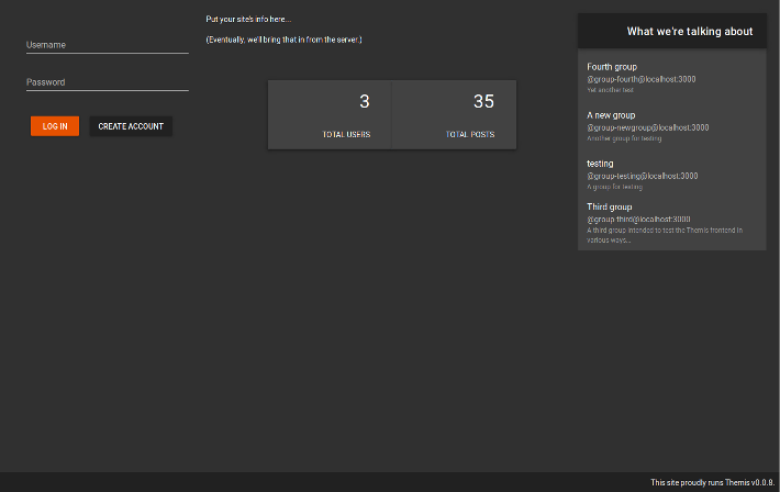
Second, the front end. I hate doing UI work. I’m not an artistically-inclined person. I work better in text than art. I can’t draw, I have no real intuition when it comes to formatting or color schemes or anything like that. It’s just not who I am. On the plus side, ActivityPub is meant to be client-agnostic. Mastodon, Pleroma, and other platforms using the standard do have builtin clients, but you can also use the servers with your own apps. (I’ve mostly been using Fedilab, but I’ll likely switch from that now that its author has outed himself as a censor.) Themis will, I hope, reach the same state. For now, though, it has a simple, functional front-end inspired by traditional newsreader programs (such as my old favorite, Xnews).
Originally, I thought to use a three-panel system, in the vein of reader programs such as Pan and Forte (Free)Agent. Or even Thunderbird, although it’s geared more towards email than newsgroups. Thus, the left-hand panel would contain the groups, while the right side would be split between threads on the top and posts on the bottom.
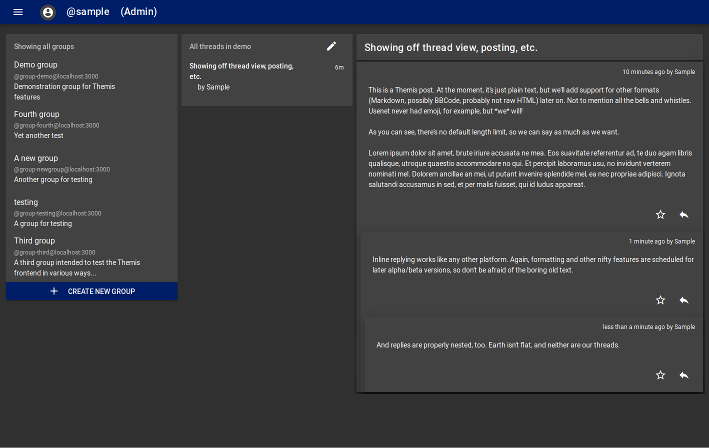
I used that for the 0.0.6 version I described in the last dev diary, and it just didn’t work. Vuetify, the UI library I’m using on this project, made it extraordinarily difficult to align all the metadata columns while preserving the tree structure of a thread. As the tree is one of the two most defining features of Themis, this was unacceptable. On top of that, three-panel is hard to make work in the browser, especially when you’re working with widescreen monitors. (Back in the day, that wasn’t an issue. We had 4:3, and we liked it!) So I scrapped that and rewrote the whole thing. Now, Themis still uses 3 panels, but they’re set up as columns. Let’s take a quick look at how they work.
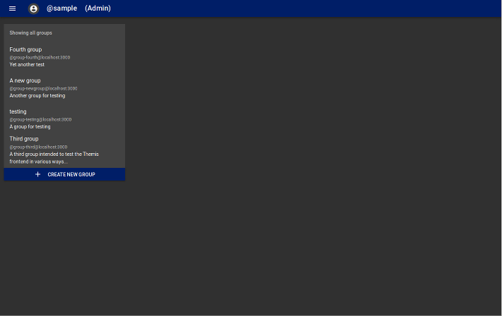
On the left is the list of groups your server hosts or otherwise knows about. Being an ActivityPub implementation, a Themis server can connect to other servers (instances, as they’re called). Some of these might not run Themis themselves; nothing’s stopping a Mastodon user, for example, from posting to a Themis group. But they can’t create groups, because their software doesn’t know how. Thus, you’ll only get groups from your server and any other Themis servers it has interacted with in the past. (Federation isn’t completely implemented yet, so take this as more of an ideal than the way things really are.)
Once you select a group, the middle panel appears. This shows the threads in the chosen group. Threads work here like they do in forums, email, or newsgroups. Each has a subject (interestingly enough, this also means all Themis posts will appear on Mastodon with content warnings) and other metadata, but you won’t get to see the text until you click.
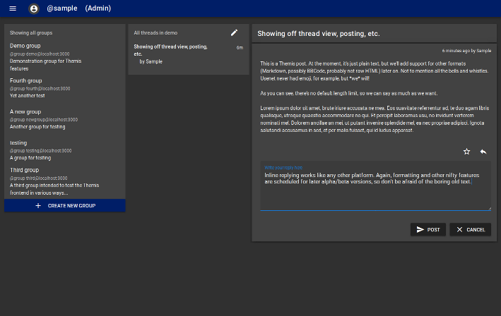
That opens the right-hand panel, the thread view. This is what I couldn’t get working in previous versions, necessitating the rewrite. But I must admit a great amount of pride at my accomplishment. Internally, it’s a hand-rolled, block-level tree component with integrated event handling. For non-developers, just know that it shows every post in a thread in a nested format similar to comments on Reddit, Slashdot, Disqus, and many other sites/services. Best of all, you have an inline reply form, so you’ll always know where your post will appear in the thread.
Also coming in the rewrite was a new navigation system, easier to work with on the developer side. Version 0.0.8 adds in some of the places it can take you, namely your profile and your list of “favorites”, which is basically the same as on any other social media platform.
Some things remain unimplemented, but I feel I’m making great progress. Before the beta release—still targeted for October 1—I want to add a new, more comprehensive filtering system. That’s the big one, in my opinion. That’s what separates Themis from the pedestrian “block or mute” systems of other platforms, and it will, I hope, allow for a higher standard of discussion. “All that’s dead might live again,” as the song says. (And if you can name that tune, I’ll put you in the contributors section!)
Keep watching for future dev diaries, and track the progress of the project over at Github. If there’s any interest, I might set up a donations page, too.


